For SPA PSA, we prepared a coherent visual identity designed to communicate care, freshness and a positive dog spa experience from the first contact with the brand. The goal was to look professional without becoming cold or clinical.
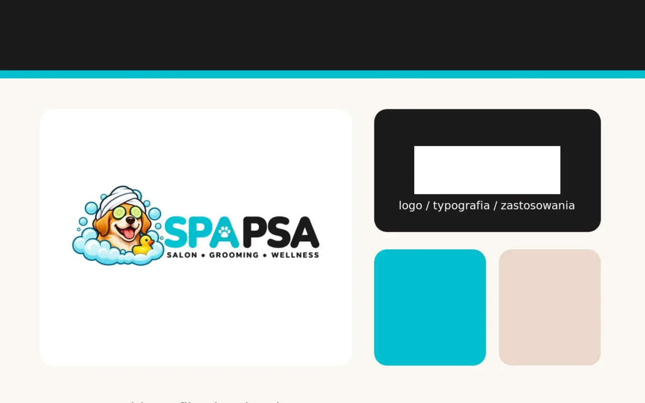
The identity is built around an illustrated dog-in-spa mark combined with the strong SPA PSA wordmark. The logo was refined and prepared for both wide website use and smaller digital applications.
The colour system combines energetic turquoise, warm cream backgrounds and dark graphite. Turquoise provides freshness and recognisability, the cream tones keep the brand light and welcoming, while graphite adds clarity and professional balance.
The system was extended across typography, website UI, buttons, favicons and presentation materials, giving the brand one consistent visual language across digital touchpoints.
The result is a friendly and memorable identity that fits the grooming category while giving SPA PSA a distinct look of its own.