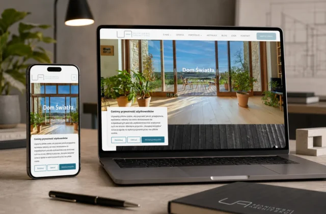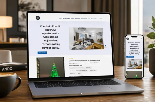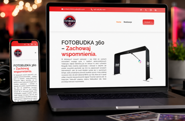
For Pod Lwami Restaurant, we organised and expanded the visual identity system in a way that preserves the recognisable classic character of the brand while preparing it for contemporary communication.
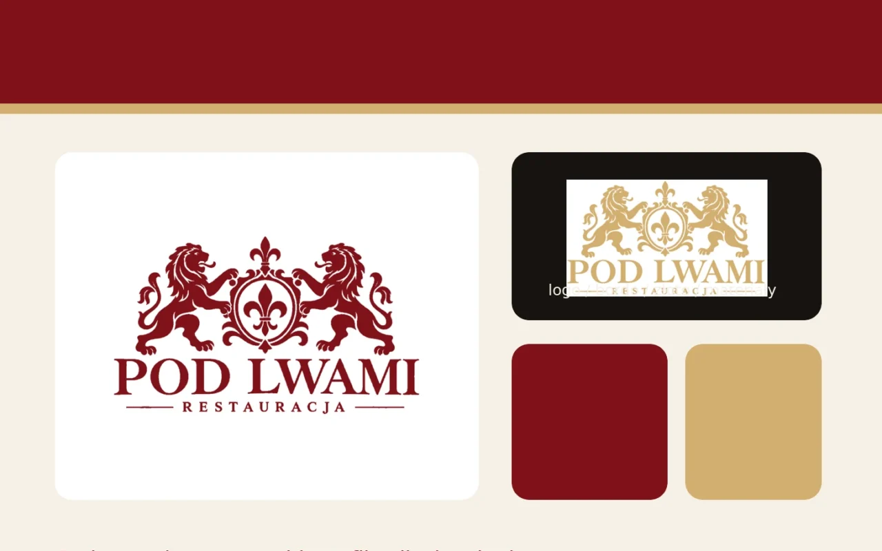
The historic lion emblem remains the central brand asset. Rather than replacing it with a new symbol, we focused on consistent usage, colour variants and adaptation for the new website and supporting materials.
The main palette is built around deep burgundy #7F1118, communicating tradition and elegance, supported by gold #D2AE6E as a premium accent and alternative logo colour for dark backgrounds. Warm cream tones balance the system.
The identity system also includes typography, logo usage, website styling, menu direction and presentation mockups, ensuring that digital communication and restaurant materials share the same visual language.
The result is a refined identity that respects the history of Pod Lwami while giving the restaurant a coherent and scalable system for future communication.