Projects /Benefic Accounting Office — visual identity and brand system
CASE STUDY

Benefic Accounting Office — visual identity and brand system

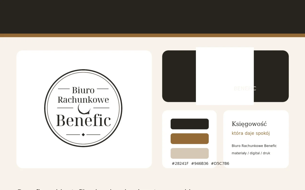
A mature accounting brand identity built around graphite typography, warm gold accents, a soft cream palette and the classic Benefic mark.

Identyfikacja wizualna Biura Rachunkowego Benefic — logo, paleta, typografia i system marki
Client
Benefic Accounting Office
Scope
Visual identity system, logo use, colour palette, typography, digital and print direction
Technology
Branding + graphic design
Year
2026

For Benefic Accounting Office, we developed a coherent visual direction combining the trust and professionalism expected from a financial brand with a calmer, more contemporary and premium feel.

The starting point was the existing circular Benefic mark. Instead of discarding established recognition, we organised its use and built a broader visual system around it.

The identity is anchored by deep graphite #28241F for professionalism and readability. Warm brown-gold #946B36 brings elegance, while cream and sand tones such as #F8F2EA and #D5C7B6 soften the financial character and create a sense of calm.

Typography plays an important role. Classic serif display type gives the brand authority and timelessness, while cleaner body typography keeps communication modern and easy to read.

The system was translated into the website, calls to action, service cards, digital communication and a direction for future printed materials. This gives Benefic a consistent framework for continued brand development.

The result is a mature, calm and professional identity that feels appropriate for accounting while helping Benefic stand apart from conventional financial branding.
Scope of work

Audit of existing mark and communication
Visual identity system organisation
Logo usage rules
Colour palette
Typography selection
Website visual direction
CTA and service-card system
Light and dark background applications
Digital materials
Print direction
Brand board
Presentation mockups

Results

Coherent and professional Benefic image
Preserved recognition of the existing logo
Distinct graphite-gold-cream palette
Premium character without losing credibility
Consistency across website and future materials
Clear framework for brand growth
Branding
Visual identity
Logo
Typography
Colour palette
Accounting
Mockup

See similar projects

Would you like a similar project for your company?

Tell us about your project and let us find an equally effective approach.