
Projects /AlejaKobiet.pl — refreshed logo and visual identity
CASE STUDY

AlejaKobiet.pl — refreshed logo and visual identity

A new AlejaKobiet.pl brand expression: distinctive feminine symbol, editorial typography and warm rose, burgundy and cream tones aligned with the redesigned magazine.

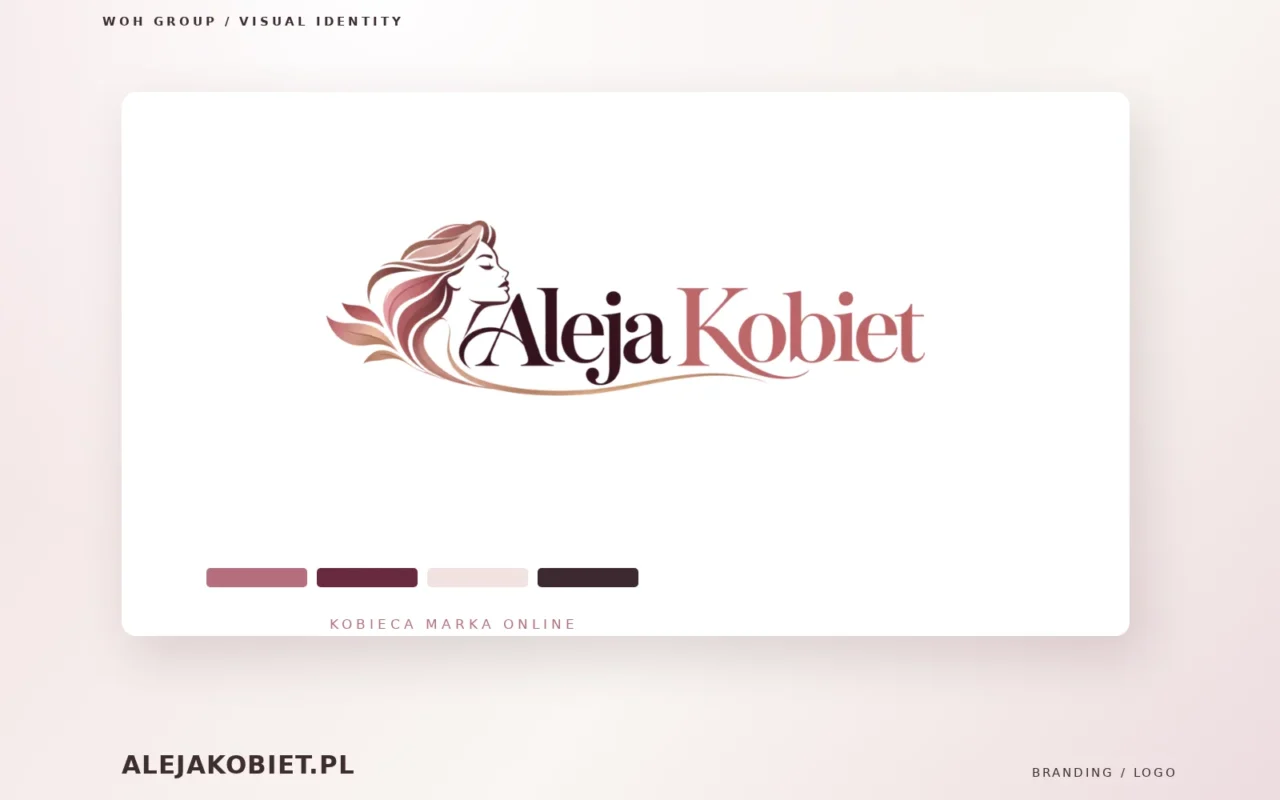
AlejaKobiet.pl – aktualny logotyp portalu kobiecego i paleta identyfikacji wizualnej
Client
AlejaKobiet.pl
Scope
Logo and symbol design, editorial typography, brand colours and visual identity
Technology
Branding, Logo, Visual identity
Year
2026

Alongside the second AlejaKobiet.pl website redesign, we refreshed the magazine's visual identity. The goal was to create a distinctive, elegant mark that performs consistently online and across editorial communications.

The logo brings together a stylised feminine portrait and expressive editorial lettering. Flowing forms and a palette of warm rose, burgundy and soft neutral tones give the brand a recognisable personality while preserving legibility.

The visual language connects the logo to the redesigned website, article layouts, navigation and promotional materials. Our portfolio presentation uses the actual current AlejaKobiet.pl logo rather than an illustrative substitute.

This is a separate 2026 branding project, while the previous logo design remains part of the portfolio history.

What we delivered

Brand identity refresh
Logo and symbol development
Editorial typography
Colour palette
Website brand integration
Digital applications
Authentic brand mockup

Project outcome

Recognisable brand signature
Distinctive editorial personality
Consistent website branding
Legibility across formats
Flexible digital identity
Branding
Logo
Visual identity
Typography

Explore related projects

Need a similar website or brand identity?

Tell us about your project, target audience and preferred launch date. We will outline the right scope and next steps.